Everything that ships
inside the license.
A conversational canvas, a generation engine that composes interfaces from an answer's own claims, a five-panel assurance console, and an export path to the framework you already use.
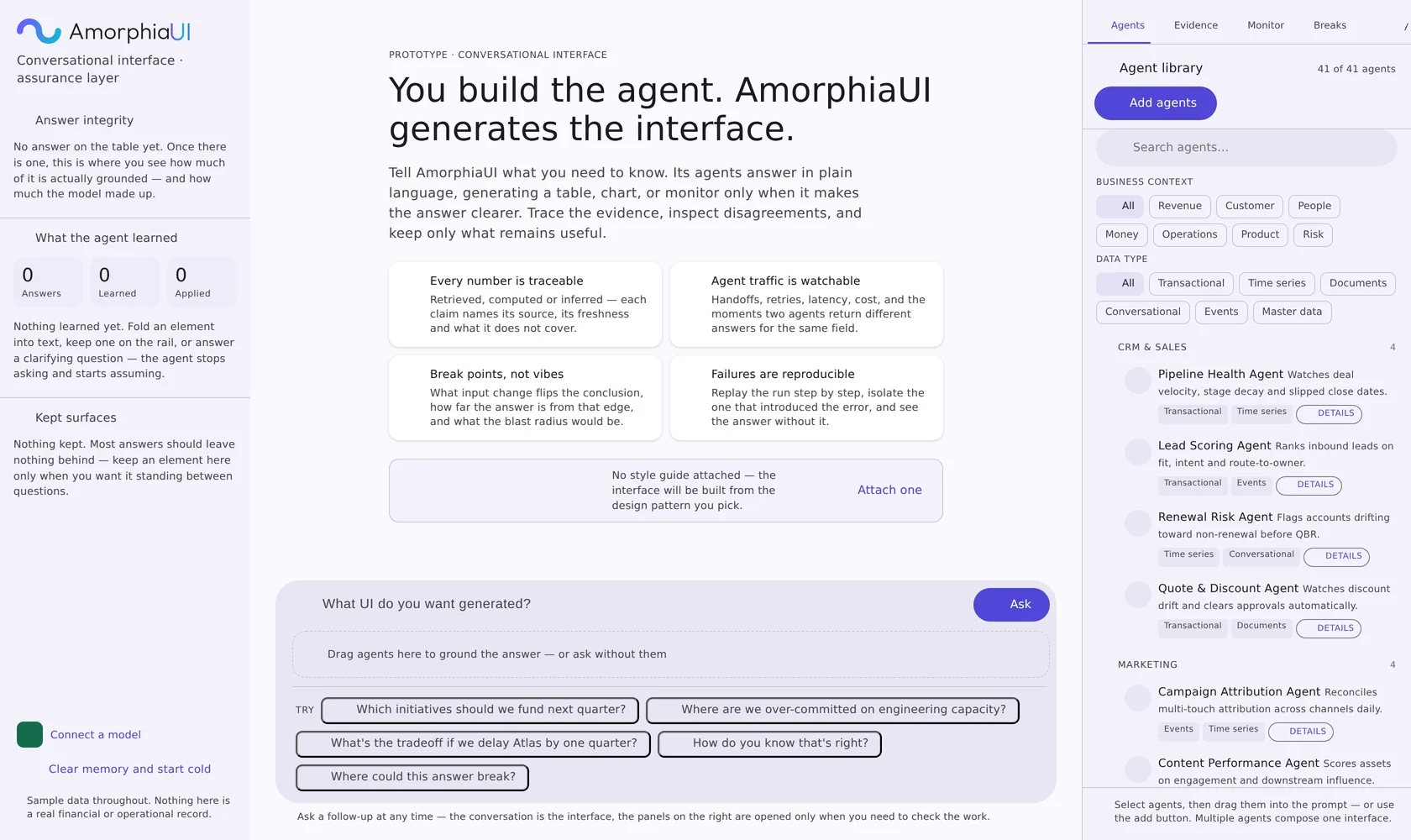
Elements are chosen from the answer, not from a template
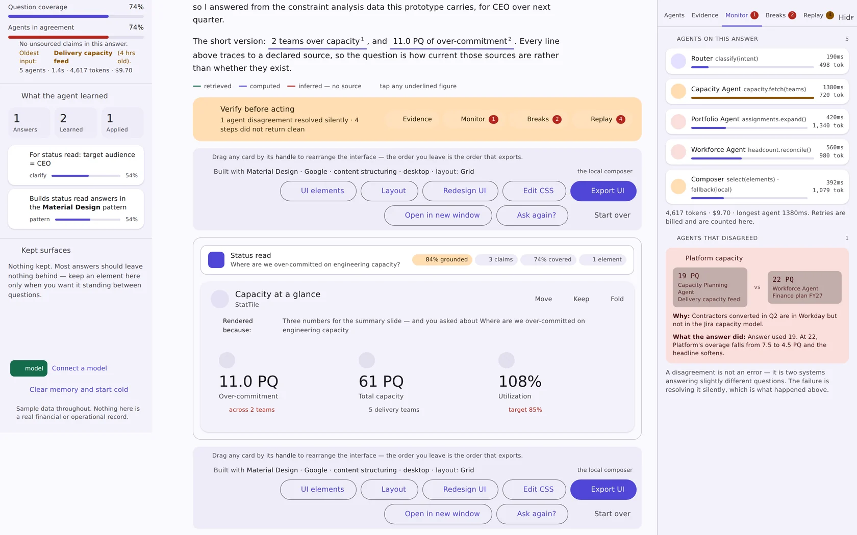
A ranked table appears because there is a ranking. A quadrant appears because position matters more than order. Every element carries a one-line rendered because note that says which part of the answer put it on screen.
Twenty-four generated elements
Five groups, each drawn only when the answer supports it — the generator says plainly when there is nothing to draw rather than filling space.
- Data display — summary stat tiles, claim and evidence table, confidence by claim, where the numbers came from, source freshness and trust
- Agent telemetry — agent activity table, run timeline, agent disagreements
- Risk and what-if — answer integrity meters, break-point list, what-if probe, what this answer does not cover
- Input controls — buttons, text fields, checkboxes, radios, toggles, dropdowns, sliders, date pickers
- Navigation, containers and feedback — tabs, sidebars, breadcrumbs, accordions, pagination, cards, tables, modals, toasts, badges, tooltips, loaders
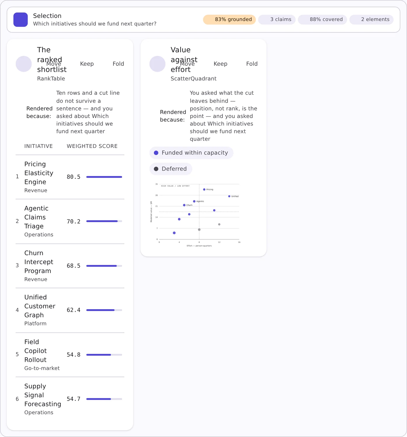
Thirty layout arrangements
The same content can hold thirty different shapes. Pick one, or let the generator choose from the question — and change your mind afterward without regenerating the answer.
- Desktop, tablet and mobile targets, chosen per build
- Density, contrast, corners, motion and chart-versus-text weight as explicit dials
- Drag any card by its handle — the order you leave is the order that exports
The layer that makes a generated answer defensible
Five panels, docked right, closed until someone needs them. Ship the monitoring and replay layer as an MCP server and it maps onto the agent stack you already run.
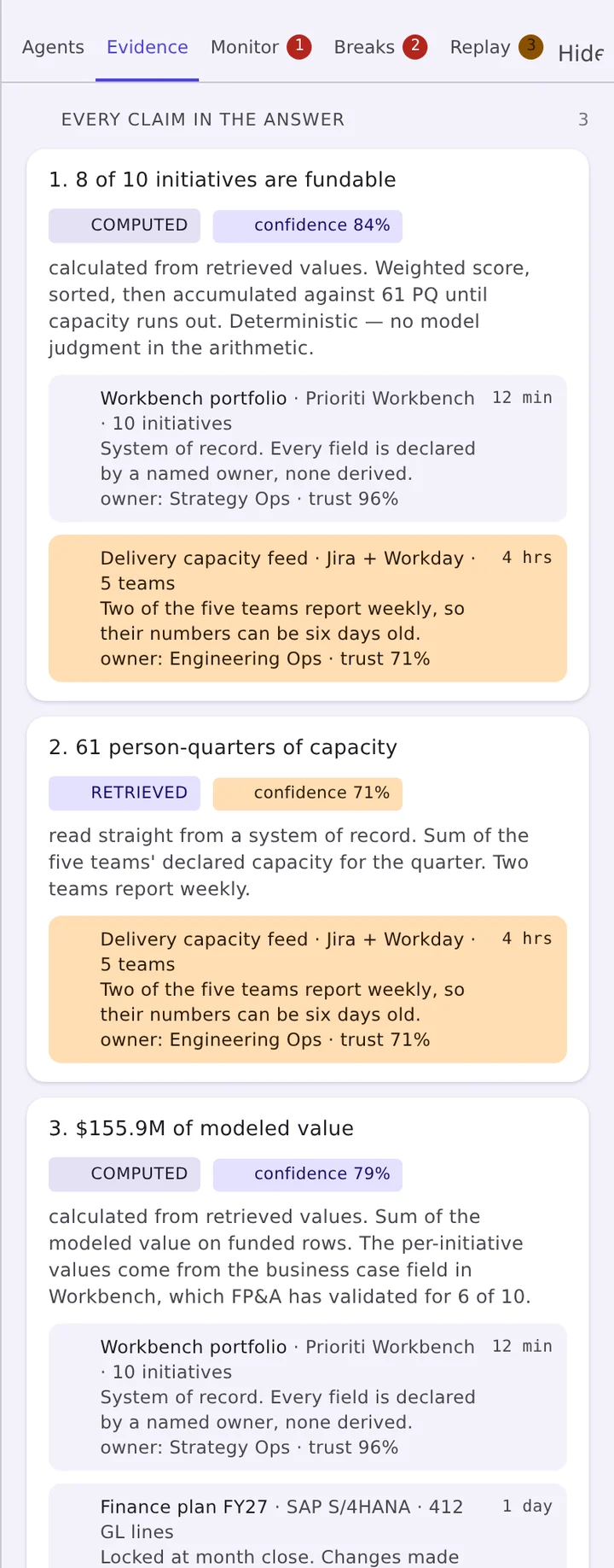
Evidence — every claim, sourced
The panel lists each claim in the answer with the method that produced it and the sources underneath it. A computed claim shows its arithmetic and states whether model judgment entered it; a retrieved claim names the system of record, the field owner and how stale the read is.
- Method labels: computed, retrieved, inferred
- Confidence per claim, trust score per source
- Freshness in plain terms, with stale sources flagged amber
- Field ownership carried through — owner: Strategy Ops · trust 96%
Monitor — agent traffic, live
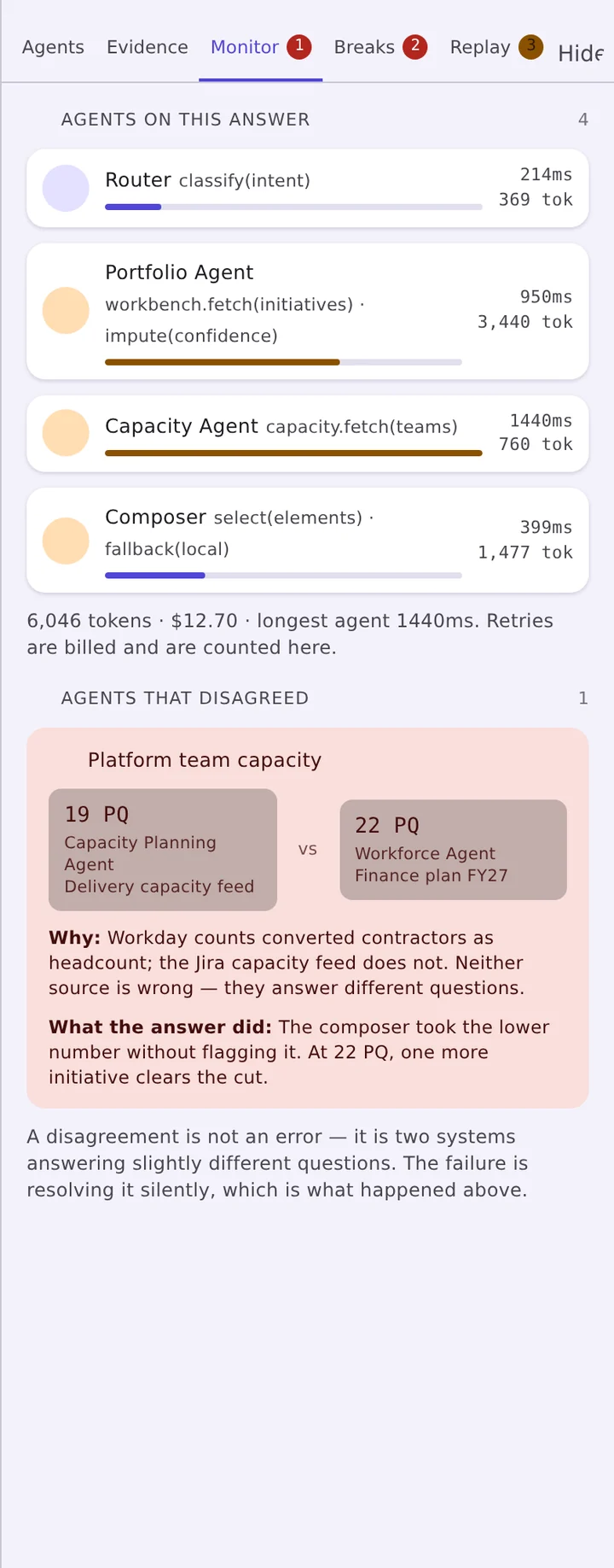
Multi-agent systems fail quietly. This panel makes the run legible while it happens and afterward: which agent ran, what it handed off, what it retried, how long it took and what it cost — and the moments two agents disagreed about the same field.
- Agent activity table and a timeline of the run
- Latency and cost attributed to the step that spent it
- Disagreements raised rather than silently resolved
- Available as an MCP server for Cursor, Claude Code and similar clients
Breaks — where this answer fails
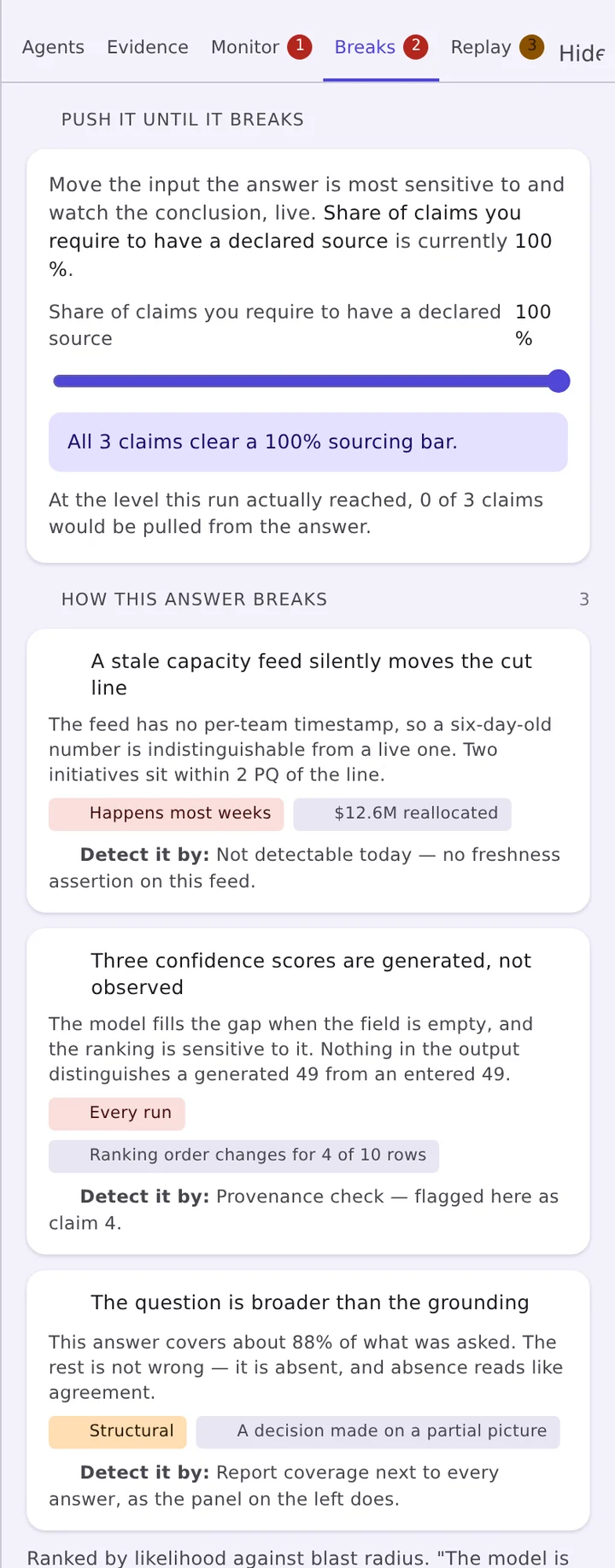
A confidence percentage tells a reader nothing actionable. A break point tells them exactly which input would have to move, by how much, for the conclusion to reverse — and what else would move with it.
- Break-point list, ordered by proximity to the edge
- What-if probe run against the live answer
- Blast radius: the claims and elements a change would touch
- An explicit list of what no reachable source can speak to
Replay — the run, step by step
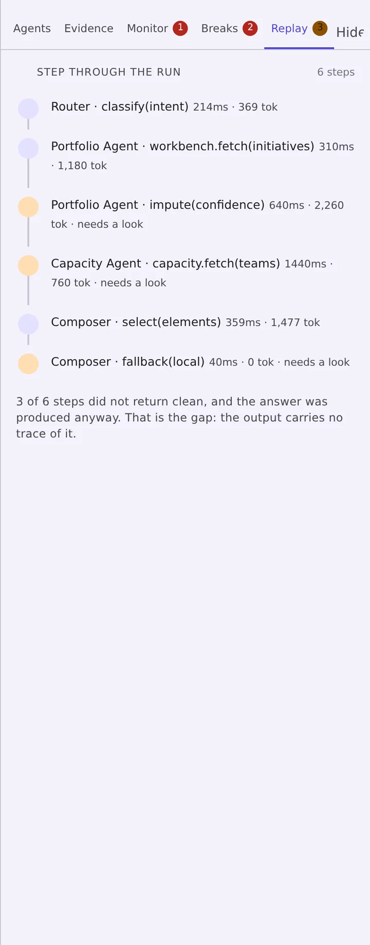
Every answer keeps its run. Walk it forward one step at a time, isolate the step that introduced the error, and recompute the answer without it — the reproducibility story an enterprise review will ask for, built in rather than bolted on.
- Step-by-step playback with the output of each step
- Remove a step and see the answer that results
- Jump straight to replay from any run summary
- Runs persist with the answer, so this works later, not only live
Answer integrity, always on screen
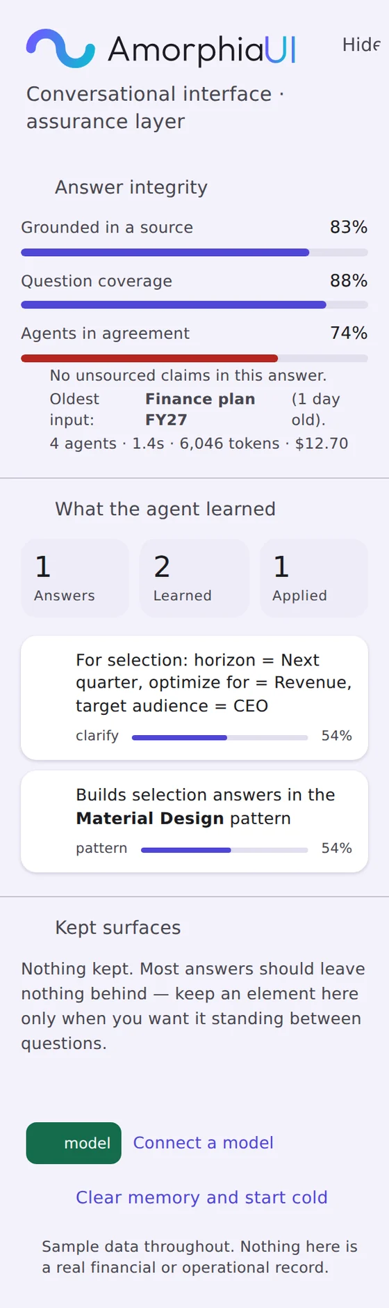
The left rail carries the three numbers that matter regardless of which panel is open — how much of the answer is grounded in a source, how much of the question it covers, and how far the agents agreed — plus what the agent has learned about this reader and which surfaces they chose to keep.
- Grounding, coverage and agreement as live meters with a stated verdict
- The oldest input behind the answer, named
- What the agent learned: answers given, preferences learned, preferences applied
- Kept surfaces — the few elements a reader pinned between questions
Bring your own agents. Build your own library.
AmorphiaUI does not ship agents — you already have them, and they are the part of your stack you would never want handed to you. The library is the place you register the ones you run, describe what each can speak to, and keep them organized as the set grows.
Register an agent once and it is available to every question after that. Select several and they compose a single interface together, rather than returning four disconnected panels.
- Add your own agents and organize them into a library that matches how your team works
- Tag each one with the business context it covers and the data types it reads, so the library filters down to the agents that can actually answer a given question
- Group them into whatever domains you use — the categories are yours to define, not ours
- Drag agents into the prompt to ground one specific question
- Edit, retire or replace any agent as your stack changes
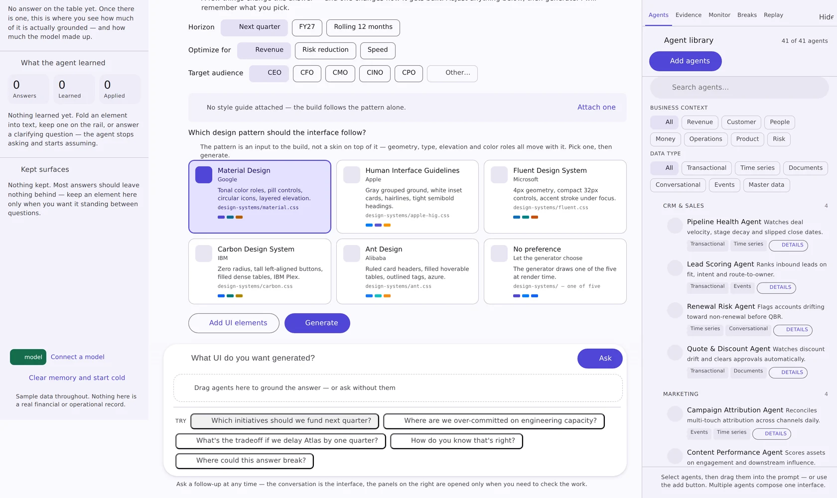
Five systems in the box, plus the one your team already has
The pattern is an input to the build. Attach a style guide and its colors, type and corner radius layer over the pattern you picked — read in the browser, uploaded nowhere.
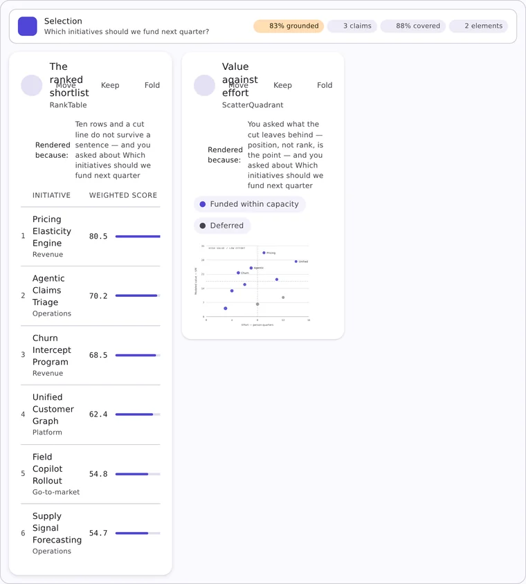
design-systems/material.css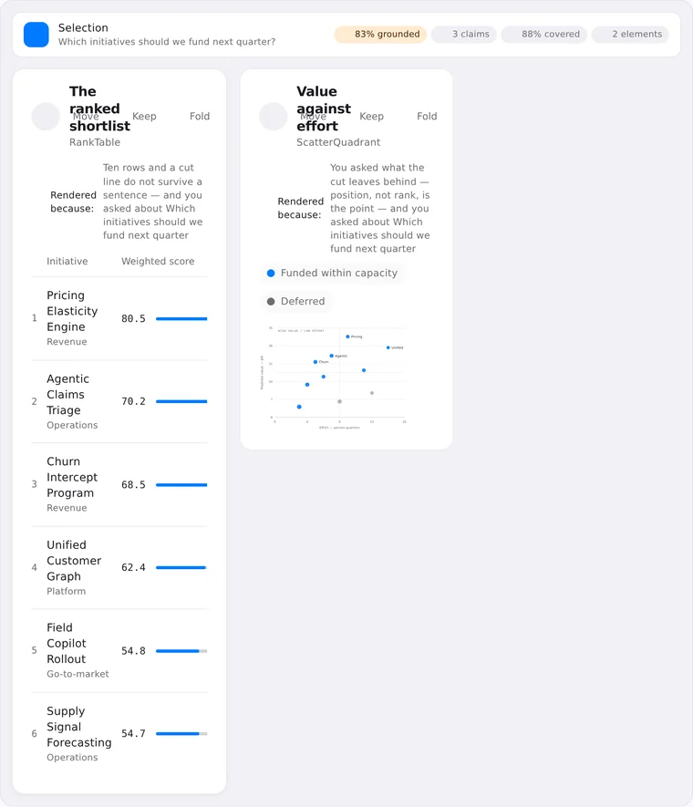
design-systems/apple-hig.css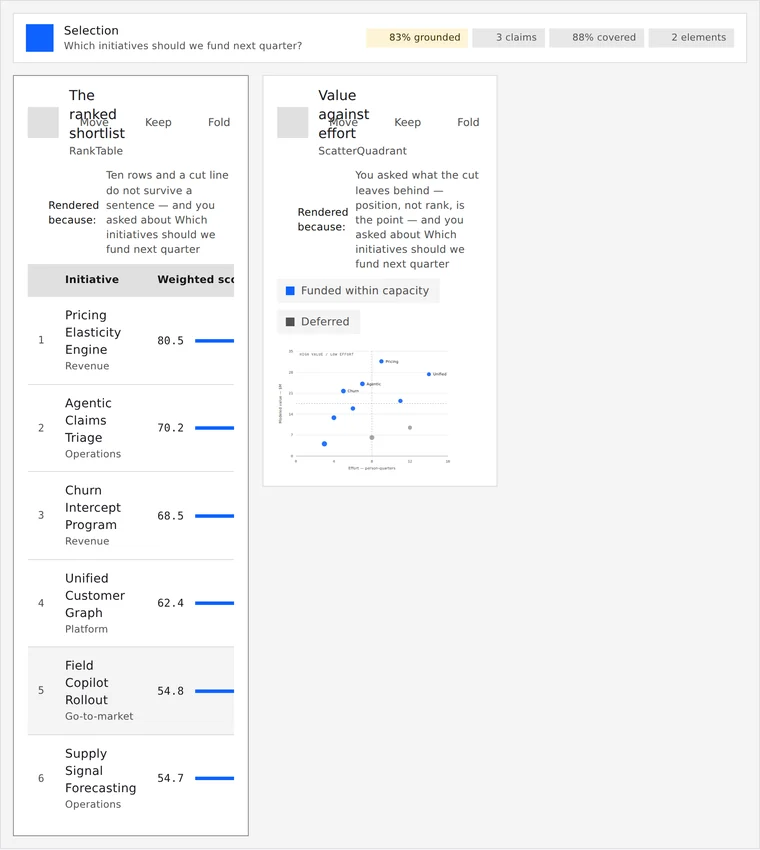
design-systems/carbon.css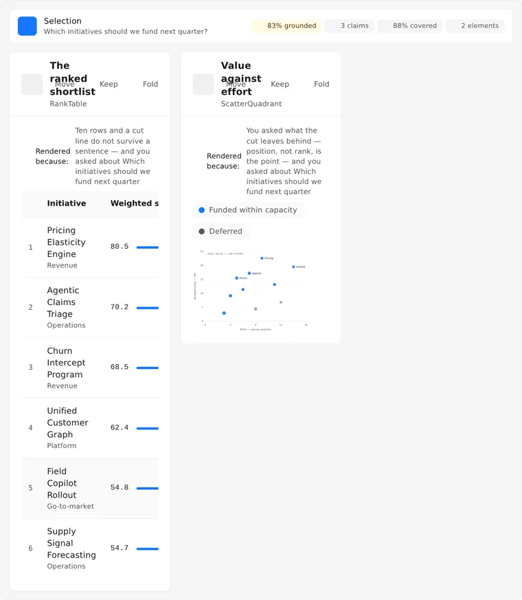
design-systems/ant.cssFluent Design System
Microsoft — 4px geometry, compact 32px controls, accent stroke under focus. design-systems/fluent.css
Your style guide
CSS custom properties, a design-token JSON export, or a written guide with hex values in it — .css · .json · .md · .txt. Drop it, paste it, or swap it against an interface that is already on screen.
Then take it out of the conversation
Rearrange, redesign, edit the CSS directly, open the interface in its own window, or package it for the framework your product is written in.
Rebuild on new dials
Change density, contrast, corners, motion or the chart-versus-text weight and rebuild the same answer without asking it again.
A properties panel
Pick any element on the generated interface and adjust it directly — the changes carry into the export.
Open it standalone
Pop the generated interface into its own window, where a different style guide can be tried against what is already drawn.
Five framework targets
Package the interface for React, Angular, Vue, Svelte or SolidJS, with a build log and a handoff you can read.
See it against your own agents.
Tell us the stack you are on and the review you have to pass. We will tell you honestly whether this is ready for it.